With the ever increasing amount of big data available and the development of dynamic route optimization algorithm, low cost shared ride becomes more and more popular. Uber and Lyft both offer shared ride service, UberPool and Lyft Line, in order to best capture the benefit of shareconomy. Via, an on-demand shared ride start up, offers flat-rate shuttle service in urban areas and has recently expanded its business to Brooklyn.
Here, I explored NYC taxi dataset of year 2015 from Google BigQuery, started with a big picture analysis of NYC taxi services, analyzed the features of NYC taxi trips, and then focused on Brooklyn local trips. I built a simplified model (rather than a sophisticated dynamic TSP algorithm) to assess shared ride efficiency in Brooklyn. I discovered that over 15% trips within Brooklyn are shareable on late weekend night. Shared ride efficiency largely depends on the total number of trips, emphasizing the importance of scale in shareconomy.
Codes can be found here.
Table of Contents
NYC taxi data from Google BigQuery
To get NYC taxi data in 2015, I use SQL to query taxi records from Google BigQuery (dataset: `bigquery-public-data.new_york.tlc_green_trips_2015` and `bigquery-public-data.new_york.tlc_yellow_trips_2015`)
I set the coordinate boundaries, as indicated in the map below, and consider trips traveling within NYC. Without setting the boundary, I observed taxi pickup and dropoff in the middle west, which were irrelevant in this analysis. 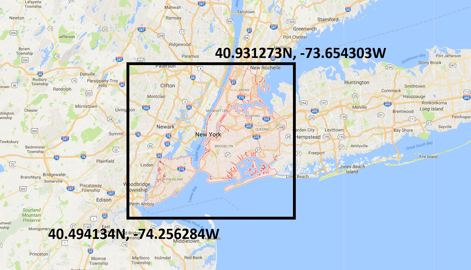 I include trips with positive trip distance and trip time, and make sure that a trip’s pickup coordinate is not the same as dropoff coordinate. I round coordinates to 4 digits with spatial accuracy of 11 meters, which allow me to aggregate by coordinates to visualize trip density on map.
#standardSQL
SELECT
pickup_datetime,
TIMESTAMP_DIFF(dropoff_datetime,
        pickup_datetime,
        SECOND) trip_time,
trip_distance,
ROUND(pickup_longitude, 4) as pickup_long,ROUND(pickup_latitude, 4) as pickup_lat,
ROUND(dropoff_longitude, 4) as dropoff_long,ROUND(dropoff_latitude, 4) as dropoff_lat,
passenger_count,
fare_amount,
tolls_amount,
Total_amount
FROM `bigquery-public-data.new_york.tlc_green_trips_2015`
WHERE
trip_distance > 0
AND dropoff_datetime > pickup_datetime
AND passenger_count IS NOT NULL
AND NOT ((pickup_longitude = dropoff_longitude) AND (dropoff_latitude = dropoff_latitude))
AND pickup_longitude BETWEEN -74.2563 AND -73.6543
AND pickup_latitude BETWEEN 40.4941 AND 40.9313
AND dropoff_longitude BETWEEN -74.2563 AND -73.6543
AND dropoff_latitude BETWEEN 40.4941 AND 40.9313
SELECT pickup_long,pickup_lat, count(*) as pickup_num
FROM [bigquery-159705:nyc_taxi_2015.2015_green_datetime_output]
GROUP BY pickup_long, pickup_lat
I use SQL to extract detailed time information from datetime: “hour”, “dayofmonth”, “dayofyear”, “dayofweek”, “month”, which are used later for aggregation of trip count by time.
#standardSQL
SELECT
  *,
  EXTRACT(HOUR
  FROM
    pickup_datetime) hour,
  EXTRACT(DAY
  FROM
    pickup_datetime) dayofmonth,
EXTRACT(DAYOFYEAR
  FROM
    pickup_datetime) dayofyear,
    EXTRACT(DAYOFWEEK
  FROM
    pickup_datetime) dayofweek,
EXTRACT(MONTH
  FROM
    pickup_datetime) month
FROM `bigquery-159705.nyc_taxi_2015.2015_green_output`
SELECT hour,dayofweek,day,month, count(*) as pickup_num
FROM [bigquery-159705:nyc_taxi_2015.2015_green_datetime_output]
GROUP BY hour,dayofweek,day,month
To extract data sample from a single day of interest, I use “dayofyear” as the selection condition.
SELECT pickup_datetime,trip_time,trip_distance,pickup_long,pickup_lat,dropoff_long,dropoff_lat, passenger_count,hour,dayofweek
FROM [bigquery-159705:nyc_taxi_2015.2015_green_time_output]
WHERE dayofyear=102
I then stored data in Google Cloud and download the data as csv.
Uber Data
Another dataset that I used is Uber data (uber-raw-data-janjune-15.csv), which is available from fivethirtyeight.
Data Cleaning
I use Python Pandas library to perform data wrangling, and audit data quality for both taxi data and Uber data (Jupyter Notebook can be found here).
A few modifications to mention:
1. I use Python Pandas library to load and process csv data.
import pandas as pd
import numpy as np
green_time_df = pd.read_csv('green%2F2015_green_by_time_02.csv')
2. There are no missing values in my data.
green_time_df.isnull().sum()
3. SQL dayofweek by default sets Sunday as 1 and Saturday as 5, while Python’s dayofweek sets Monday as 0 and Sunday as 6. To make the format consistent, I set Monday as 1 and Sunday as 7 for all of my data.
green_time_df['dayofweek']=green_time_df['dayofweek']-1
green_time_df['dayofweek']= np.where(green_time_df['dayofweek']== 0,7,green_time_df['dayofweek'])
df2['dayofweek']=df2['dayofweek']+1
4. To get weekly data, I extract the week number “weekofyear” for 2015.
def get_week_of_year(day):
 new_day = day + 2
 return int(new_day*1./7)+1
green_time_df['weekofyear'] = green_time_df['dayofyear'].apply(get_week_of_year)
5. I group data by month, week, dayofweek, hour to understand the timely total or average for yellow and green taxis.
green_by_month = green_time_df.groupby(['month'],as_index=False).sum()[['month','trip_num']]
6. In later analysis of shared ride efficiency, I focus on the week 15 in 2015, which ranges from 2015-04-06 to 2015-04-12, and use Taxi and Uber data in this week. The reason why I use week 15 is because from my initial data exploration, week 15 appears to be representative. In addition, I use Green Taxi data and Uber data for the analysis of Brooklyn trips. I will elaborate the difference between Green and Yellow Taxis trips in the following session.
mask = (df['Pickup_date'] > '2015-04-05') & (df['Pickup_date'] <= '2015-04-12')
df2 = df.loc[mask].copy()
7. In order to understand local trip density, I decide to convert coordinates to county, neighborhood, and zip code. I use Geocoder API to get the address information and parse it into zip code, county, neighborhood. API query is quite slow (2 seconds per query), I decide to focus on single days in week 15 from Green Taxi data: I use Wednesday to represent a weekday, and Saturday, Sunday to represent weekends. Still, it takes a few days to get all data processed.
from geopy.geocoders import Nominatim
import re

df['pickup_long'] = df['pickup_long'].astype(str)
df['pickup_lat'] = df['pickup_lat'].astype(str)
df['dropoff_long'] = df['dropoff_long'].astype(str)
df['dropoff_lat'] = df['dropoff_lat'].astype(str)
df['pickup_coord']=df[['pickup_lat', 'pickup_long']].apply(lambda x: ",".join(x), axis=1)
df['dropoff_coord']=df[['dropoff_lat', 'dropoff_long']].apply(lambda x: ",".join(x), axis=1)
df.drop(['pickup_long','pickup_lat','dropoff_long','dropoff_lat'],axis=1,inplace=True)

geolocator = Nominatim()

def get_geocode(coord):
    time.sleep(0.5)
    addr = geolocator.reverse(coord, timeout=60).address
    if addr == None:
        zipcode = 'NaN'
        zone = 'NaN'
        county = 'NaN'
    else:
        strs = [x.strip() for x in addr.split(',')]
        num = str(re.findall(r"\D(\d{5})\D", addr))
        num = str(filter(str.isdigit, num))[:5]
        zipcode = num
        county = strs[-5]
        if strs[-6]=='Manhattan' or strs[-6]=='BK':
            zone = strs[-7]
        else:
            zone = strs[-6]
    return zipcode+','+zone + ',' + county

def get_zipcode(zone):
    return zone.split(',')[0]
def get_neighborhood(zone):
    return zone.split(',')[1]
def get_county(zone):
    return zone.split(',')[2]

def add_fields(df):
    df['pickup_zone']=df['pickup_coord'].apply(get_geocode)
    df['pickup_zipcode'] = df['pickup_zone'].apply(get_zipcode)
    df['pickup_neighborhood'] = df['pickup_zone'].apply(get_neighborhood)
    df['pickup_county'] = df['pickup_zone'].apply(get_county)
    df['dropoff_zone']=df['dropoff_coord'].apply(get_geocode)
    df['dropoff_zipcode'] = df['dropoff_zone'].apply(get_zipcode)
    df['dropoff_neighborhood'] = df['dropoff_zone'].apply(get_neighborhood)
    df['dropoff_county'] = df['dropoff_zone'].apply(get_county)
    df.drop(['pickup_coord','dropoff_coord','pickup_zone','dropoff_zone'],axis=1,inplace=True)

add_fields(df)
8. Uber trip records do not show pickup coordinates, so I merge the trip table with lookup table with county and neighborhood information.
df_zone = df2.merge(zone,left_on='locationID',right_on='LocationID',how='left')
Data Exploration and Visualization
I use Tableau, Pandas, and matlibplot to perform data exploration and visualization. Check my next post.
References:
[1] Analyzing 1.1 Billion NYC Taxi and Uber Trips, with a Vengeance, http://toddwschneider.com/posts/analyzing-1-1-billion-nyc-taxi-and-uber-trips-with-a-vengeance/
[2] The Data Science of NYC Taxi Trips: An Analysis & Visualization, http://www.kdnuggets.com/2017/02/data-science-nyc-taxi-trips.html
[3] Measuring accuracy of latitude and longitude? http://gis.stackexchange.com/questions/8650/measuring-accuracy-of-latitude-and-longitude